 Since I don't have many PTI colors, I substituted similar colors from Stampin' Up!'s palette: I used Naturals Ivory, Kiwi Kiss, Aqua Mist (PTI), Tempting Turquoise and Cameo Coral.
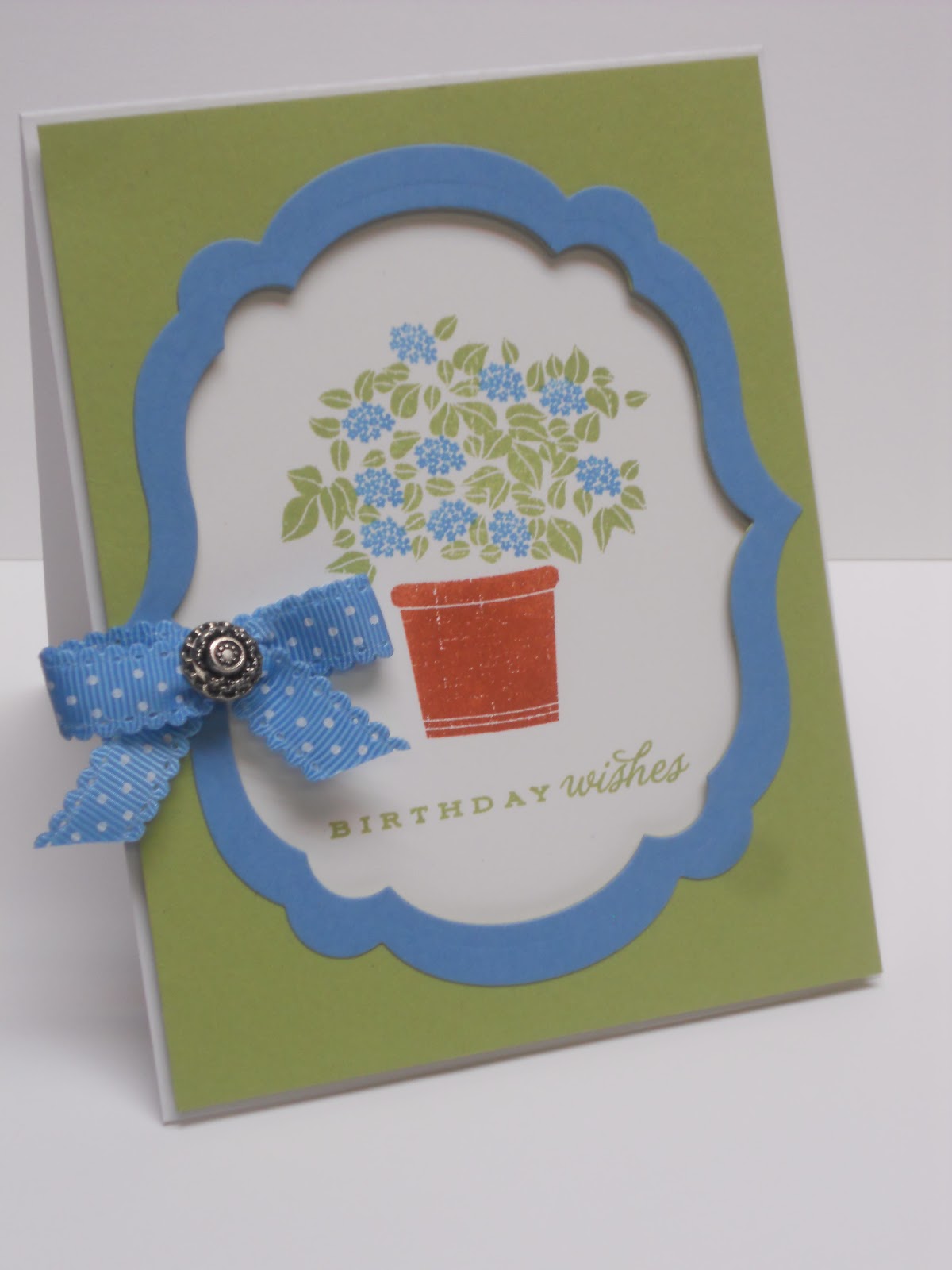
 I love Garden Variety II, particularly the vintage quality of the images. I didn't do justice to the lovely terracotta pot, as I finished up this card late last night and redid the cut-out pot a couple times trying to find a good match for Berry Sorbet. It looks okay in real life but the camera didn't pick up the nice texture on the image. "Birthday wishes" is from Tea for Two; the twill ribbon is PTI and the little butterfly brad is from SU!'s latest SAB offering.
The mat and frame were cut using the Labels Embosslits and by popping the panel up, it created an interesting little shadow-box effect.

I'm sorry to say I didn't really like these colors together. I think the turquoise and the green are a little too harsh with the Aqua Mist mat. (Granted, Hawaiian Shores is a little softer than Tempting Turquoise.) So I decided to remake the card using colors I find more pleasing in combination. I love Pear Pizzazz and Marina Mist together (you might have noticed it's one of my favorite combos!) and the pot is stamped in Cajun Craze, which shows the texture much more clearly. A bow of Scallop Dots ribbon accented with an Antique brad finishes off the new version.
I selectively inked "celebrate" from Think Big Favorites #9 for the interior sentiment.

I'm so thankful that I was able to join my niece and her family and friends to wish her joy and happiness on this milestone birthday!

This is a great card. I really like those images from Garden Variety II. I have to agree that the colors work better in your second card. I love this week's make it monday, but will admit to having trouble with all those color schemes. Oh, to have Nicole's talent...
ReplyDeleteBeautiful design, Karen. I have to agree with you on the color combo, the second card is my fave too :)
ReplyDeleteI love the colors you chose (hahahhaa I chose those colors too!) But I loveeeee what you did with the colors!
ReplyDelete