Monday, October 31, 2011
Booooo!
Oh boy, Halloween will soon be upon us and I'm a little apprehensive about all the decorating awaiting me. I've sort of cultivated a reputation in our neighborhood for having the scariest house - really, I don't know how it happened.... it's just that every year I find one more creepy addition to our sccaaaarrrryyyyy stuff.... (Last year it was a last-minute markdown gargoyle which bellows a truly frightening exhortation to those who would dare to approach). I've recently been identified (by my daughter's new classmate) as that scary monster who scared her little sister so bad that she points to our cul-de-sac whenever they drive by...
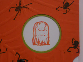
But for a slightly tamer approach, I saw this ViewMaster style card on Dawn Olchefske's blog ( http://dostamping.typepad.com/) and was surprised at how easy it was. I think my little grand-niece and -nephews will love it! After all, I don't want them to be freaked out by their Great Auntie Sas!
I'm hoping to get the kids to make some big gravestones out of styrofoam to tuck into the spiderwebs this year. What frights do you have planned for your little trespassers??
Sunday, October 30, 2011
Spooky treats
For the top of the box, I stamped the image from Haunted Forest in black StazOn on vellum and colored it on the back with markers; I also sponged color for the full moon and the twilight sky. I mounted this piece onto white or vanilla card stock and then created the little black spiky mat using the Pinking Hearts border punch. It just barely fit on the box cover but I had my heart set on using this image!
The Hershey's nuggets were covered with Avery labels stamped with an image from It's a Wrap Holidays. I stamped the Happy Halloween from Haunted Forest into the lid and added a little punched black cat (wish I had a spider punch for the little confetti pieces inside - I admit I'd get a perverse pleasure eliciting a real "EEK!" from the recipient!)
I think my office mates will enjoy a little Halloween fear.... er... I mean, cheer!
Friday, October 21, 2011
Pretty pyramids
Monday, October 17, 2011
Well preserved
I made a bunch of cards using this mason jar stamp from PTI's Friendship Jar set and die when it came out last year. There are lots of stamps in this series portraying fillers (flowers, marbles, marshmallows - you name it!) but the Well preserved sentiment captivated me and I made all jelly jars (mostly Concord Crush grape, Peach Parfait preserves and Cherry Cobbler jam).
I enjoyed using lots of different textures to bring interest to the simple focal point and solid color palette. Here I've used the Perfect Polka Dots embossing folder, as well as an interesting texture on the Wild Wasabi diecut: instead of an embossing folder, I ran this piece through the Big Shot in a little plastic shallot bag. I really love how this turned out!
I used a birthday sentiment on the inside and thought them rather rustic, sassy little cards for my peers (ahem). I like the combination of Cherry Cobbler, Crumb Cake and Concord Crush on this one, with a little bit of texture from the Perfect Details Texturz plate on the layers.
I used a little DSP on this one, including the layer under the embossed Nestabilites die cut and also on the jar lid cover.
Nothing fussy. Simple country charm. Just like grape jelly.
Sunday, October 9, 2011
Thoughts and Prayers
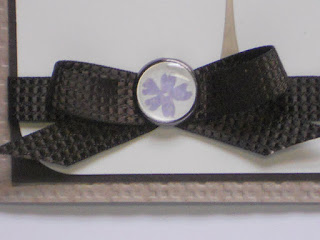
This card is simple and sincere, with just the barest touch of decoration in the form of the Square Lattice embossed card base, the quilted Early Espresso ribbon and the brad I made using a Build-a-Brad with a little Wisteria Wonder flower.
I inked the tree stamp with Crumb Cake and Old Olive markers, and the sentiment with Early Espresso. The inside reads "Please know that I care."
I hope this reminder that I care about them brings comfort to my dear "other" children.
Thursday, October 6, 2011
Sunshine
I wanted this Sunflower stamp the moment I saw it, and I knew what I wanted to do with it. I've seen several examples of it in monotones, most often some shade of brown, and (no offense intended) I haven't liked them one bit. It's a sunflower, after all, a flower I have adored all my adult life.
I was working on a different project which was not coming out the way I wanted. I finally put it down, and my eye happened upon my uninked Sunflower. I inked it in So Saffron and then used Crumb Cake and Chocolate Chip markers to color the inner parts, and stamped it onto Very Vanilla, while I said a little prayer that it would come out as I'd envisioned. And, oh so satisfyingly, it did! The lovely little quote from Emerson (from Pursuit of Happiness) is the perfect complement. (And it fits in a medium square envelope, no extra postage required!)
So simple, but so exquisite (if i do say so myself!)
Saturday, October 1, 2011
Overwhelm the world!
I love this color combination: Calypso Coral, Lucky Limeade and Early Espresso. The vine is from the set Borderlines. I like the balance of the ruffled ribbon on one side and the slender border of the new In Color DSP on the right. The flower was punched with the Fancy Flower punch from the same DSP pack, and the butterfly was stamped with Butterfly Prints and punched with the Butterfly punch. I like the way the words in the butterfly look with the printed DSP, just as the dots in the vine image echo the dots in the large flower.
I wish Sarah well in her endeavor. The world is a better place because of her gift.