Thursday, March 29, 2012
Daisy, daisy
I bought this set, Flower Fusion #9, for the express purpose of recreating this card from Melissa Bickford, who designed all the Flower Fusion sets for Papertrey Ink - thank you, Melissa, I'm crazy about Flower Fusion!
I ended up changing the color scheme and used the outline flower stamp instead of the solid one, and I think I used a different stamp in the Background Basics: Text Style set, inked in Crumb Cake on Crumb Cake card stock, which I sponged on the edge with PTI Fresh Snow ink. Anyway, I love it!
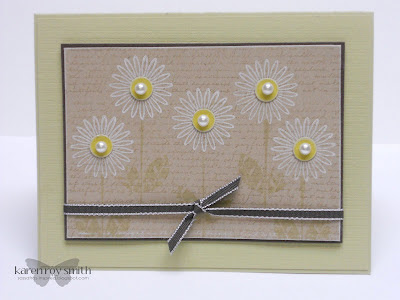
The River Rock card base was impressed with PTI's Linen & Canvas impression plate; the thin mat and 1/8" taffeta ribbon are Early Espresso, the stems are River Rock, and the flower centers are Daffodil Delight topped by pearls and popped up slightly on glue dots. I haven't yet decided whether to add a sentiment; maybe a little tag pinned to the ribbon?
I still plan to recreate Melissa's card using her color scheme and the solid daisy image. It will be fun to step away from the softer colors I'm usually drawn to and play with some red ink!
Sunday, March 25, 2012
Beautiful butterfly
This is another entry for PTI's Make It Monday challenge to use graduated color. The lavender color didn't work well for the sky background in my first card, but it sure does make for a beautiful butterfly, don't you think?
I cut the butterfly with SU's Beautiful Butterflies Bigz die (of course!) The doily was cut from a die I borrowed from Linda; I'm pretty sure it's from My Favorite Things. The background was stamped with Text Style using Versamark ink on (retired) Lovely Lavender. A little string of pretty pearls finishes off this very simple 4 1/2" x 4 1/2" card.
Graduated background challenge
Well, I finally did it - I bought some Copic markers! I have thought long and hard about whether I wanted to invest in a collection, and until now, have decided against it, mostly because I don't color in stamped images very much. When I do, I'm usually satisfied with the results I get with my Stampin' Up! markers, since I use them mostly for informal coloring. (My preferred technique for having a multi-colored image is to use the markers directly on the stamp.)
But Nichole's demonstration on how to make a graduated color background was so enticing that I abandoned my first decision to use reinkers with a watercolor brush, and instead headed over to Michael's to buy some Copics (luckily I had a coupon for the entire purchase!) They didn't have a great selection of colors, but I found half a dozen that I liked and came home to try them out.
I have to say, they didn't disappoint! I love the way the colors blended when I repeatedly drew the brush tip over the edge where the different colors met. Something tells me that my collection of Copics is going to grow!
This card is really simple in its design, since the colors are so vivid. I decided to try something with some paper scraps from another project I'm making: I glued thin strips of the scraps together and die cut the balloons from them, then stamped the balloons with Papertrey Ink's Up Up and Away. (I don't really like the colors of the balloons but I do like the contrast.) Happy Birthday comes from one of the Flower Fusion sets (I forget which one).
I really enjoyed this technique; it's great for the sky/grass background. I also used the technique in a different way for another card - check out my next post to see.
Saturday, March 24, 2012
Spring has sprung!
While I was driving home from work on Tuesday, I spotted this azalea in full bloom - pretty hard to miss, even tucked behind a dumpster near a construction site.
I made sure to bring my camera the next morning and snapped quick photos of all the blooms I passed on my way to work. There were a surprising number of them.
The photos are not very good quality, because I took them from behind the wheel of my car, some of them as I was stopped at a stop sign! I just wanted to capture the evidence of our extremely early spring to share with my sister in New Hampshire. Since I didn't get around to posting these until the weekend, I suspect that she'll be enjoying blooms of her own by now.
Many of these trees and shrubs don't normally bloom for another month around here, like the magnolia above.
It's kind of crazy seeing all the different kinds of flowers blooming at the same time. I guess that's the price we have to pay for skipping winter, which is okay by me!
Wednesday, March 21, 2012
Happy spring!
I really love the Flower Fusion stamp sets and dies - they are so fun to play with! Flower Fusion #11 has tulip images (although I used Flower Fusion #2 for the stems).
Some tulips are Blushing Bride and some are Daffodil Delight; the stems are Lucky Limeade, stamped off once (still too dark, in my opinion; they make the piece too busy). The background layers are Pear Pizzazz and Old Olive, on a white base.
My favorite part of this card is the gingham grass, stamped with Background Basics: Gingham and then punched with a Martha Stewart grass punch.
All the stamps in today's card are from Papertrey Ink. Happy Birthday is from Wreath for All Seasons and happy spring is from Tag Its #2. The ribbon is a (retired) Old Olive taffeta - one of my all-time favorites - and the designer brad is from Stampin' Up!'s Sale-A-Bration bundle.
Even though I didn't quite achieve what I pictured in my mind, I still think this is a fun and happy card. I know I'd be cheered up to get it in the mail!
Sunday, March 18, 2012
Another kiss
I decided to try the colored kissing technique again with my original color combination: Bashful Blue and Marina Mist. I stamped Upsy Daisy with Fresh Snow ink (PTI) and then kissed it in Marina Mist with Background Basics: Gingham (PTI). Although the color didn't stay true on the white ink, I think I like it anyway.
I also prefer the gingham pattern to the canvas I used in my first attempt. The sentiment is from the PTI's Tag-Its #2 set. The corners were punched using the Scallop Trim corner punch.
Not my best work, but I'm still finding it fun to play along with Papertrey's challenges. Perhaps next time I should get started before Sunday night!
Kissing challenge
This challenge sounded so easy to me and I looked forward all week to finding time to create a card. I had all kinds of ideas floating around in my mind. The technique is to "kiss" a solid stamp with a patterned stamp inked in another color and stamp over the first stamped image.
Once again, I found the challenge easier said than done. I had decided to use a white base image, using PTI's Fresh Snow ink. When it came to finding suitable stamps, I had a hard time finding a pair of stamps that would work well together. The first image I used was a small flower stamped on Bashful Blue but the pattern didn't show up very well. It's too bad, because I had the card all designed in my head, with more white clouds kissed with a pattern...
I then used a butterfly stamp and kissed it with a delicate design, but once again, the pattern was too faint. I think the white ink just overwhelmed the delicate pattern. (I did try it again using a darker ink, but it still didn't satisfy me.)
I finally ended up using Stampin' Up!'s Upsy Daisy, stamped in Fresh Snow, this time on a dark card stock (Concord Crush). Then I kissed the stamp with the (retired) Canvas background stamp in Concord Crush ink. The darker colors resulted in a more noticeable pattern, even though the flowers themselves were rather delicate.
I also stamped the base card of Almost Amethyst with the Canvas stamp in Concord Crush. The birthday sentiment is from Create a Cupcake. The bit of twill ribbon is from PTI but I don't recall the color; I bought it a few years ago because it matched Almost Amethyst.
I've used this technique in the past and I'm sure I will use it again, but I think I'll wait until I'm inspired by the stamps at hand, rather than try to force it on a Sunday night!
Thursday, March 8, 2012
Sending sympathy
For some time now, I've had some Mat Stack 3 panels in Very Vanilla, Crumb Cake and Baja Breeze sitting on my desk, waiting for an idea. I seem to be very productive lately with PTI's Iconic Images so I decided to stamp the bird image and thought it might make a good sympathy card. The sentiment is from Stampin' Up!'s Petite Pairs.
I sponged the edge of the Baja Breeze panel with Crumb Cake ink so it would stand out against the base layer. The ribbon is Crumb Cake taffeta and the button is from SU's Twitterpated collection (in the Occasions mini catalog) - I love these buttons!
At first I thought I would love this bird panel on the Crumb Cake base which was stamped with one of the background stamps from PTI's Background Basics: Text Style. I have been making a lot of backgrounds with this set during the last few weeks and loving the effect.
But this card just creeps me out. (I think it reminds me of Edgar Allen Poe's poem The Raven...) I mean, it's supposed to comfort someone, not give them the heebie-jeebies!
So I put together another panel, just like the first one, and used a Baja Breeze base this time with an overlay of Very Vanilla cut from PTI's Quatrefoil die. What a difference, don't you think? The brighter background lifts the rather somber panel and makes it much more friendly, and soothing.
I think I'm going to lift off the panel from the first card and remake it like the second. (And read something cheery before bed to fend off the nightmares...)
Monday, March 5, 2012
Frame challenge
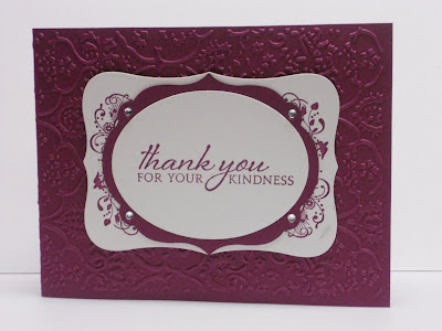
Just a quick post to add my project to the weekly PTI challenge to create a larger frame from a frame-type stamp. I struggled to find a good combination here, as I don't have a lot of frame images. One of my new Stampin' Up! SAB sets, Elementary Elegance, does, however, have a frame image, with a crown and lots of flourishes - not a stamp I'd normally use. After some trial and error (mostly error), I ended up stamping the image mostly in the corners of a Spellbinders die cut (I don't remember the name or even what this shape is called!) I stamped an oval die cut with a sentiment from PTI's Iconic Images and layered it onto another die cut made with a Framelits die, and layered that over the altered frame image, to mask the overlap.
The card base was textured using a Cuttlebug embossing folder. I think all the swirls and flourishes of the stamp and the embossing go well together, along with the rhinestones on the Framelit die, and Rich Razzleberry lends a regal tone.
It's certainly not one of my best creations (even if you ignore the smudge), but after giving up a couple times over the weekend, I decided at the last minute to finish it up and enter it into the challenge. Better late than never, I guess!
Thursday, March 1, 2012
Spring blossoms
I got the idea for this card from a blog called Damask Love but did it a little differently, since I had trouble stamping over the edge of the diecut flower post-its - the ink didn't cover the edges completely, probably because of the thickness of the paper (thin as it is...). She used fun foam to cut out leaf stamps using dies and perhaps the foam was more springy than my rubber stamps. Or perhaps it was the full-adhesive post-it notes that made it work better. I want to try it again with thinner tracing paper (or the full-adhesive post-its, if I can find them) because I do like the effect.
I stamped a solid flower image (ring-shaped, actually) and embossed it with clear embossing powder, then used a leaf image from the set called Build a Blossom to stamp over the embossed image in Pear Pizzazz (after masking off the center). The edges still did not get covered completely with ink but the effect is nice anyway. I then stamped the centers with a solid circle stamp in Blushing Bride, wiped away a little excess from the embossed flowers and dotted them with a black marker. The sentiment is from a stamp I got at Ink About It, which actually is a little defective - see the short "I" in birthday? The rubber isn't complete at the top! Maybe I can replace it next time I'm there.
I think this will make a nice spring birthday card - it reminds me of apple blossoms, which will be here before we know it!
Subscribe to:
Posts (Atom)